In one way, I am shocked that it's been so long since I've blog. In another way, I'm not surprised at all. At some point, I realized that during the biggest part of the stay at home period of Covid, I coped with shopping. And for some reason I'm still working towards fully reorganizing my space to get my stash under control. I've actually already done a lot of purging. I participated in two successful garage sales in the summer of 2022 and summer of 2023. I don't do my own - I get a table at our local stamp/scrapbook store. It's just easier than trying to sell online via Facebook & then figure out getting the items to the person.
That said, I have been crafting. I have two groups of friends who I make cards with consistently. One is a monthly meet up & the other is twice monthly/every two weeks. Plus I scrapbook with a friend once a month. So I am doing stuff... I just haven't been good at sharing it online, particularly on my blog. I will be changing that starting this month. I commit to one post a week. My hope is that somehow I can figure out how to promote my blog so people comment on it. The lack of comments/acknowledgement of the effort it takes to get photos of the projects & post is what brought me down & deterred me from posting, if I'm honest.
In the title of this post I said 'Part 1,' I swear there will be a part two. These cards were made for a friend to send out; she specifically wants Christian themed Christmas cards. The next set I will be making this week will be secular, because they are for people at work.
The first two cards were made using the December sheetload of cards from Call Me Crafty Al. I love her Youtube channel. I made 8 cards with it, 4 of each of the two you see here.
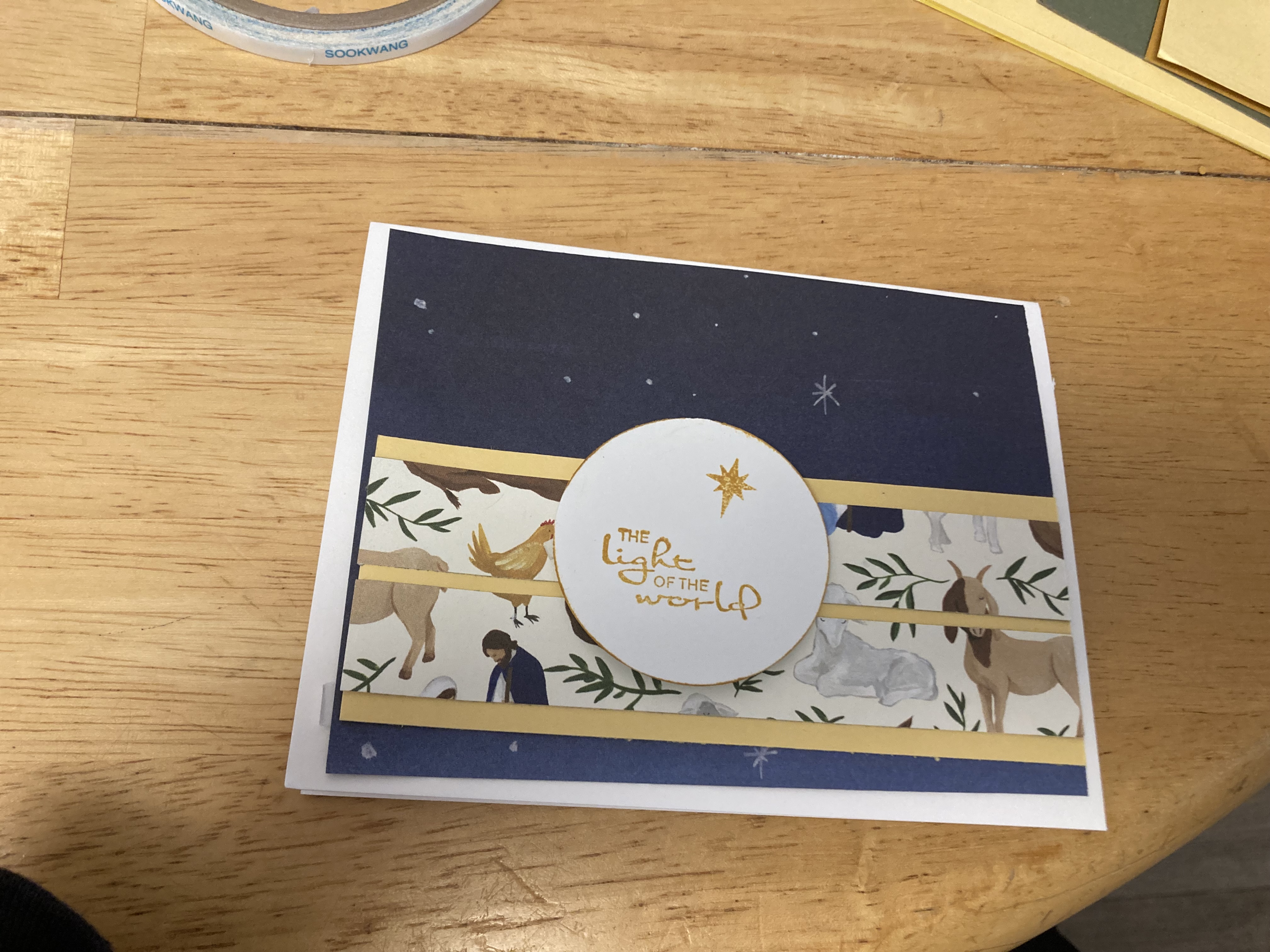

This was the November sheetload. The original doesn't have the border punch at the bottom. It was a 'happy accident' because I needed to do something to make the gold cardstock strip look better; I cut the pattern paper strips shorter than the original by mistake. I'm still not sure if I read the diagram incorrectly or I lined my paper up wrong in my trimmer. Either way, I'm happy with the result. It's another where I made 4 of each combo.

This final set of cards is the May 2022 sheetload of cards. It used 6x6 paper, which I really like because I have so much of it and it was good to use up some of it.

Card details: All products Stampin' Up unless noted otherwise
Sets 1 & 2:
Pattern paper: Photo Play Silent Night
Ink: Bumble Bee
Cardstock: Basic White, So Saffron, Bumble Bee
Sentiment: Peace to You
Sentiment: Peace to You
Set 3
Pattern paper: Echo Park, collection unknown
Ink: Bumble Bee
Cardstock: Basic White, Always Artichoke
Sentiment: Peace to You
Sentiment: Peace to You


